


| 样式说明 | Gif 图 |
|---|---|
| 提示警告框 | 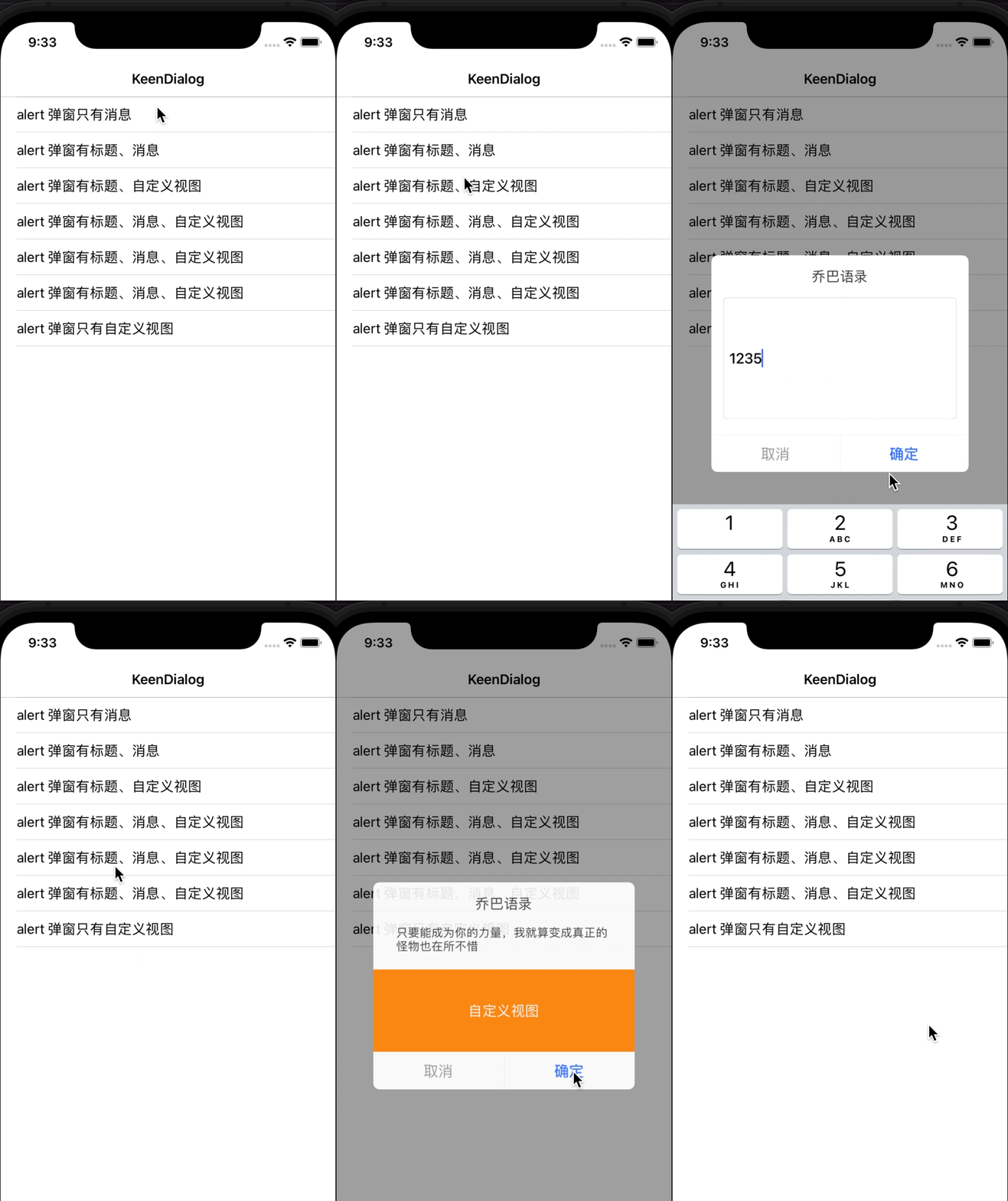 |
| 上拉弹窗 | 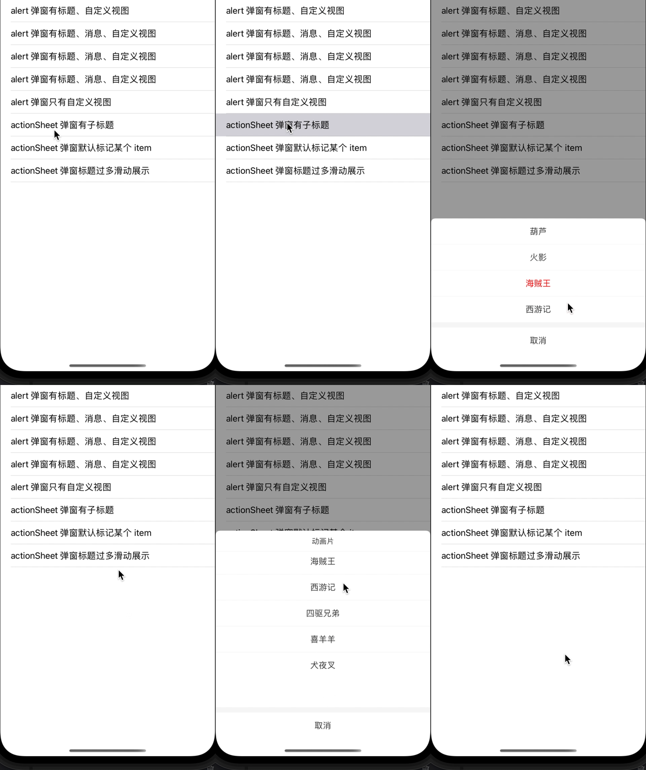 |
| 菜单弹窗 | 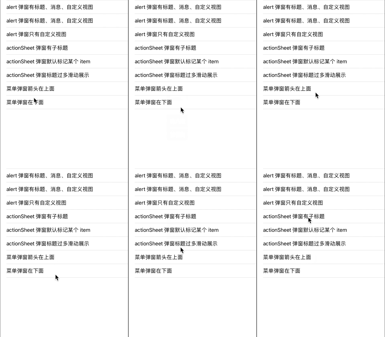 |
| 日期、地址弹窗 | 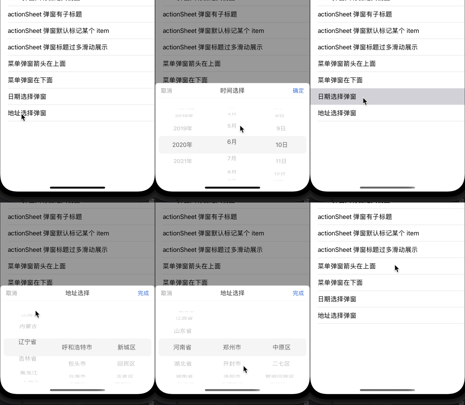 |
| 吐司弹窗 | 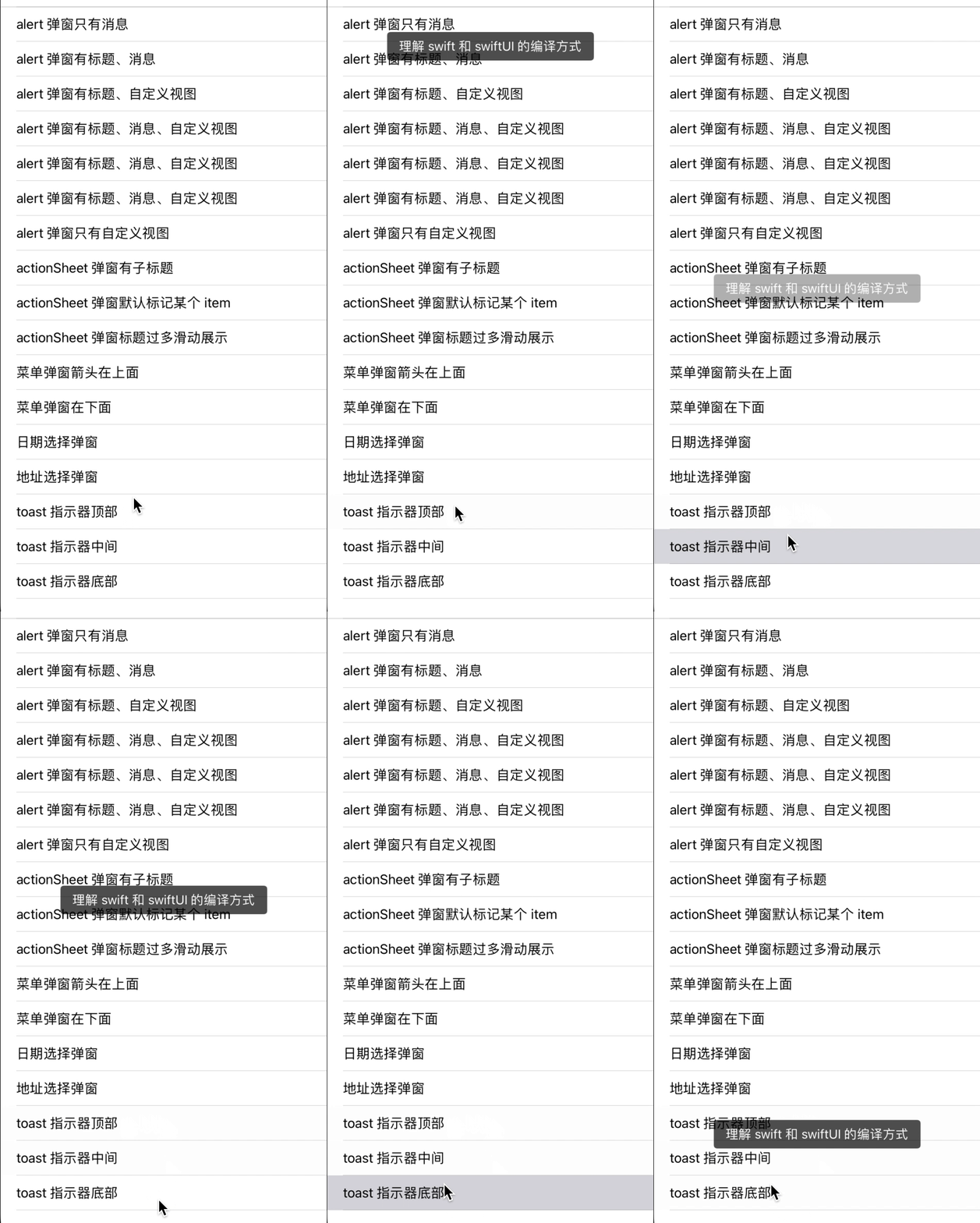 |
| 指示器弹窗 | 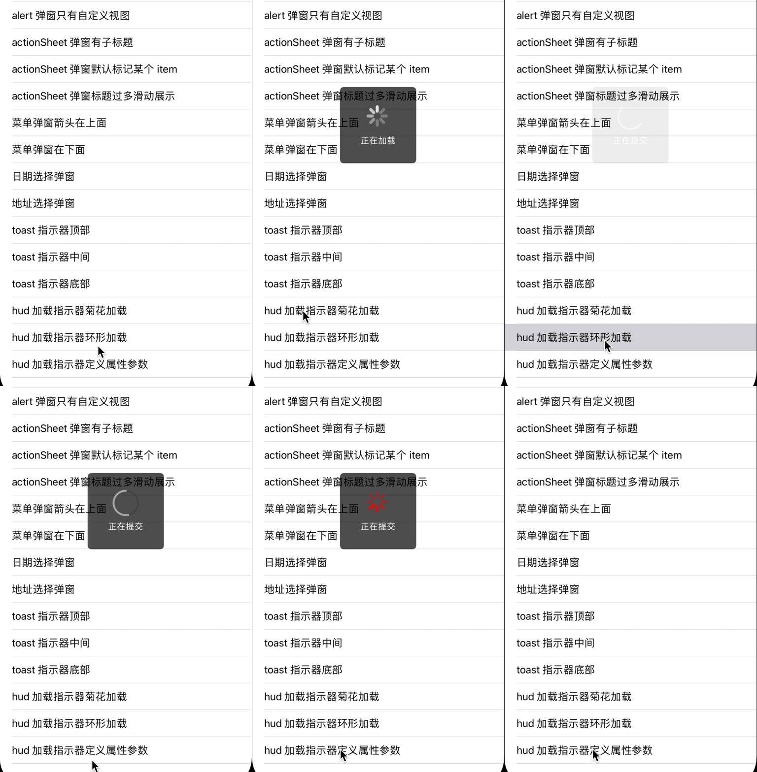 |
| 下拉弹窗 | 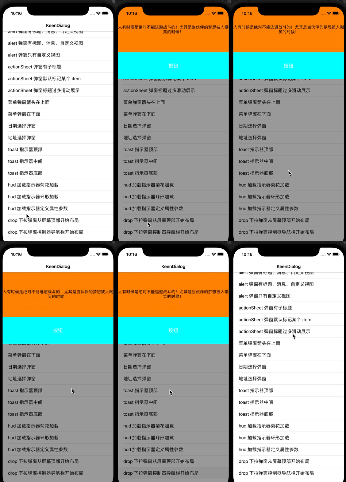 |
- 提供 6 种样式的对话框弹窗,对外接口统一,接入非常方便,对业务无侵入,可根据视觉自由定制属性参数
- 基于
UILabel、UITextView、UIPickerView、UITableView等控件的自定义对话框 - 提醒框内容过多支持滑动显示,支持自定义视图,其中对文本框的键盘弹起期间进行了处理
- 地址选择框提供了默认的全国省份城市数据,三级联动选择,其中数据源支持外部配置
- 指示器加载框提供 2 种样式,若是不满足要求的话,外部支持自定义加载视图
- 菜单框提供 2 种样式吐司框提供 3 种样式,具体可自由配置
- 日期选择框提供 7 中样式,支持各个日期列是否联动
支持的弹窗样式
enum Style: Int {
    /// 提醒弹窗
    case alert = 0
    /// 上拉弹窗
    case actionSheet = 1
    /// 下拉弹窗
    case drop = 2
    /// 菜单弹窗
    case menu = 3
    /// 吐司弹窗
    case toast = 4
    /// 指示器弹窗
    case hud = 5
}支持的样式
/// 按钮布局方式
enum ItemAxisStyle: Int {
    /// 水平排列
    case horizontal
    /// 垂直排列
    case vertical
}

/// 自定义视图位置
enum ViewPostion: Int {
    /// 顶部
    case top
    /// 中间
    case middle
    /// 底部
    case bottom
}
属性对象 KeenAlertMsgAttributes 中可查看支持定制的参数属性
// ...
/// 自定义视图 若控件包含文本框 需设置 observerKeyboard 属性
public var customView: UIView?
/// 自定义视图高度 必须指定 否则无效 默认 0
public var customViewHeight: CGFloat = 0
/// 自定义视图四周边距  top: 0pt left: 15pt bottom: 20pt right: 15pt
public var customViewInset = UIEdgeInsets(top:0, left:15, bottom:20, right:15)
/// 自定义视图位置 其位置相对(标题、消息)  默认 top
public var position: KeenAlertMsg.ViewPostion = .top
/// 键盘顶部间隔 默认 20pt 针对自定义视图含有文本框等控件
public var keyboardMargin: CGFloat = 20
/// 是否监听键盘事件 默认 false
public var observerKeyboard: Bool = false
// ...
使用示例
let view = UITextField()
view.backColor(.orange)
var attri = KeenAlertMsgAttributes()
attri.customView = view
attri.customViewHeight = 100
attri.position = .bottom
attri.observerKeyboard = true
showAlert(
    title: "乔巴语录",
    msg: "只要能成为你的力量,我就算变成真正的怪物也在所不惜",
    cancelTitle: "取消",
    doneTitle: "确定",
    callback: { index in
        print("index \(index)")
}, attributes: attri)属性对象 KeenActionSheetAttributes 中可查看支持定制的参数属性
// ...
/// 凸显 item 下标  默认 -1
public var highlightedIndex: Int = -1
/// 凸显 item 标题颜色 默认 #FF4644
public var highlightedColor: UIColor = UIColor.color(hexString: "#FF4644")
// ...
使用示例
var attri = KeenActionSheetAttributes()
attri.titleHeight = 45
// ...
showActionSheet(
    title: nil,
    items: ["拍摄\n照片或视频", "从手机相册选择", "用剪影制作视频"],
    highlightedIndex: -1,
    cancelTitle: "取消",
    callback: { index in
    print("index \(index)")
}, cancel: {
    print("cancel")
}, attributes: attri)支持的样式
enum DateMode: String {
    /// 年月日时分
    case ymdhm = "yyyy-MM-dd HH:mm"
    /// 月日时分
    case mdhm = "MM-dd HH:mm"
    /// 年月日
    case ymd = "yyyy-MM-dd"
    /// 年月
    case ym = "yyyy-MM"
    /// 月日
    case md = "MM-dd"
    /// 时分
    case hm = "HH:mm"
    /// 年
    case y = "yyyy"
}
属性对象 KeenDatePicker 中可查看支持定制的参数属性
// ...
/// 选择结束是否自动记录数据 默认 false
public var autoRecord: Bool = false
/// 日期控件高度 默认 216pt
public var datePickerHeight: CGFloat = 216
/// 日期模式 默认 ymd
public var mode: KeenDatePicker.DateMode = .ymd
// ...
使用示例
var selectValue: String!
// ...
var attri = KeenDatePickerAttributes()
attri.autoRecord = true
// ...
showDate(
    mode: .ymd,
    title: "时间选择",
    defaultValue: selectValue,
    minDate: nil,
    maxDate: Date(),
    cancelTitle: "取消",
    doneTitle: "确定",
    callback: { value in
    print("value \(value)")
}, cancel: {
    print("cancel")
}, attributes: attri)属性对象 KeenAddressPickerAttributes 中可查看支持定制的参数属性
// ...
/// 选择结束是否自动记录数据 默认 false
public var autoRecord: Bool = false
/// 地址控件高度 默认 216pt
public var addressPickerHeight: CGFloat = 216
// ...
使用示例
var attri = KeenAddressPickerAttributes()
attri.autoRecord = true
// ...
showAddress(
    title: "地址选择",
    defaultValue: (self.province, self.city, self.area),
    cancelTitle: "取消",
    doneTitle: "完成",
    callback: { province, city, area in
    print("index \(province.index) \(province.name) \(province.code)")
    print("index \(city.index) \(city.name) \(city.code)")
    print("index \(area.index) \(area.name) \(area.code)")
    self.area = area
    self.city = city
    self.province = province
}, cancel: {
    print("cancel")
}, attributes: attri)支持的样式
enum ArrowPostion: Int {
    /// 顶部
    case top
    /// 底部
    case bottom
}
属性对象 KeenMenuListAttributes 中可查看支持定制的参数属性
// ...
/// 箭头宽度 默认 16pt
public var arrowWidth: CGFloat = 16
/// 箭头高度 默认 10pt
public var arrowHeight: CGFloat = 10
/// 箭头位置 默认 top
public var position: KeenMenuList.ArrowPostion = .top
// ...
使用示例
var selectIndex: Int = -1
// ...
var attri = KeenMenuListAttributes()
attri.highlightedColor = .red
// ...
showMenu(
    position: .top,
    origin: CGPoint(x: 100, y: 150),
    imgs: nil,
    items: ["唐三藏", "孙大圣", "猪八戒", "沙和尚", "如来佛", "观世音"],
    offsetX: 25,
    highlightedIndex: selectIndex,
    callback: { index in
    print("index \(index)")
    self.selectIndex = index
}, attributes: attri)支持的样式
enum Postion: Int {
    /// 顶部
    case top
    /// 居中
    case center
    /// 底部
    case bottom
}
属性对象 KeenToastAttributes 中可查看支持定制的参数属性
// ...
/// 视图左右的外边距 默认 40pt
public var viewMargin: CGFloat = 40
/// 视图内边距 默认 top: 8pt left: 15pt bottom: 8pt right: 15pt
public var viewInset: UIEdgeInsets = UIEdgeInsets(top:8, left:15, bottom:8, right:15)
/// 视图距离父视图顶部的偏移量 默认 100pt
public var viewOffsetTop: CGFloat = 100 + CGFloat.safeAreaTopHeight
/// 视图距离父视图底部的偏移量 默认 100pt
public var viewOffsetBottom: CGFloat = 100 + CGFloat.safeAreaBottomHeight

/// 视图位置 默认 center
public var position: KeenToast.Postion = .center
//...
使用示例
var attri = KeenToastAttributes()
attri.viewMargin = 30
// ...
showToast(
    title: "理解 swift 和 swiftUI 的编译方式",
    duration: 2,
    position: .bottom,
    attributes: attri,
    aView: nil
)支持的样式
enum Style: Int {
    /// 菊花
    case system
    /// 环形
    case torus
}支持自定义加载视图,对应属性参数具体可查看KeenHudAttributes 类
// ...
/// 加载视图宽度 默认 40pt
public var itemWidth: CGFloat = 40
/// 加载视图高度 默认 40pt
public var itemHeight: CGFloat = 40
/// 自定义的加载视图
public var customView: UIView?
// ...
使用示例
/// 1.
var attri = KeenHudAttributes()
attri.viewRadius = 8
showHud(
    title: "正在加载",
    style: .torus,
    attributes: attri,
    aView: view
)
/// 模拟请求耗时
DispatchQueue.main.asyncAfter(deadline: .now() + 5) {[weak self] in
    self?.dismissHud(self?.view)
}

/// 2.
showHud()
/// 模拟请求耗时
DispatchQueue.main.asyncAfter(deadline: .now() + 5) {[weak self] in
    self?.dismissHud()
}
具体参数属性等配置可下载查看源码实现
platform :ios, '10.0'
use_frameworks!

target 'TargetName' do

pod 'KeenDialog'

end
iOS版本要求10.0+Swift版本要求5.0+
QQ: 2209868966 邮箱: chongzone@163.com
若在使用过程中遇到什么问题, 请
issues我, 看到之后会尽快修复
KeenDialog is available under the MIT license. See the LICENSE file for more info.