


This is a fork.
@kmanueldc/react-odontogramis a fork ofreact-odontogramby Pratik Sharma (biomathcode), distributed under the MIT License. It is maintained independently and is not affiliated with or endorsed by the original project. For the original package, seereact-odontogramon npm.
A modern, interactive React Odontogram component for dental chart visualization and data collection. Built with SVG and React hooks — fully customizable, accessible, and designed for clinical or academic applications.
On top of the original react-odontogram 0.5.x, this fork brings the features of
vue-odontogram
to React: primary and mixed dentitions, explicit FDI quadrant numbering, tooth
states, five-surface diagrams, clinical findings (NTS Peru catalog), a surface
guide, a tooth inspector, overlays and full i18n, without breaking the 0.5.x
API. See MIGRATION.md and CHANGELOG.md.
Links: GitHub · Issues · Original project
- Packages · Preview · Demo · Installation · Quick start
- Dentitions · Layouts · Selection and conditions · Props · Callbacks
- Tooth states · Notations · Surfaces · Findings and treatments
- Keyboard · Custom tooltip · Overlay and anchors · Text and language · Theme
- Public API · License and SVG provenance · Development · Credits
| Package | Platform | Install |
|---|---|---|
@kmanueldc/react-odontogram |
React web | npm install @kmanueldc/react-odontogram |
packages/react-native-odontogram |
React Native | Not yet published from this fork |
The React Native package in this repository comes from the original project
and is not published under this fork yet; the original is available as
react-native-odontogram.
Both packages share the same tooth data model, notation helpers, selection payloads, condition coloring, layout modes, and half-chart options. The 0.6 features (dentitions, states, surfaces, findings) are web-only for now.
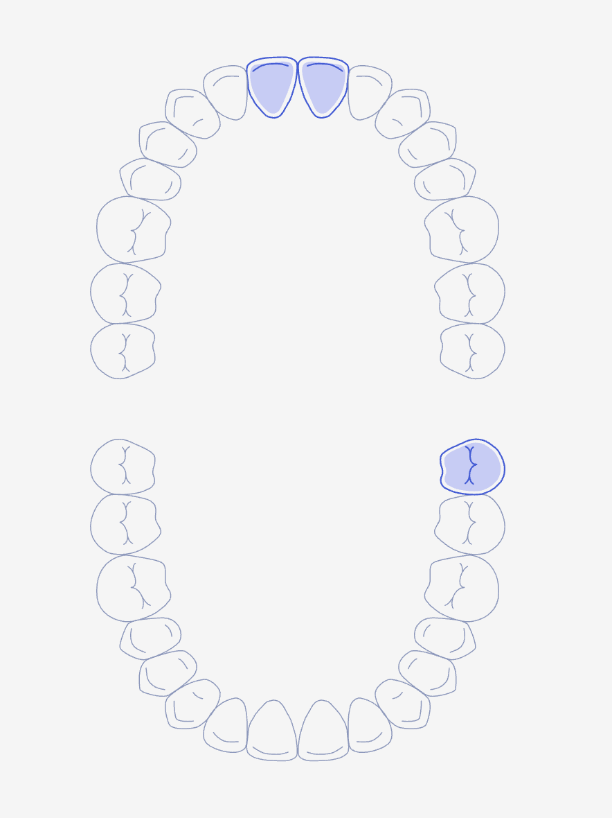
| Light Mode | Dark Mode |
|---|---|
 |
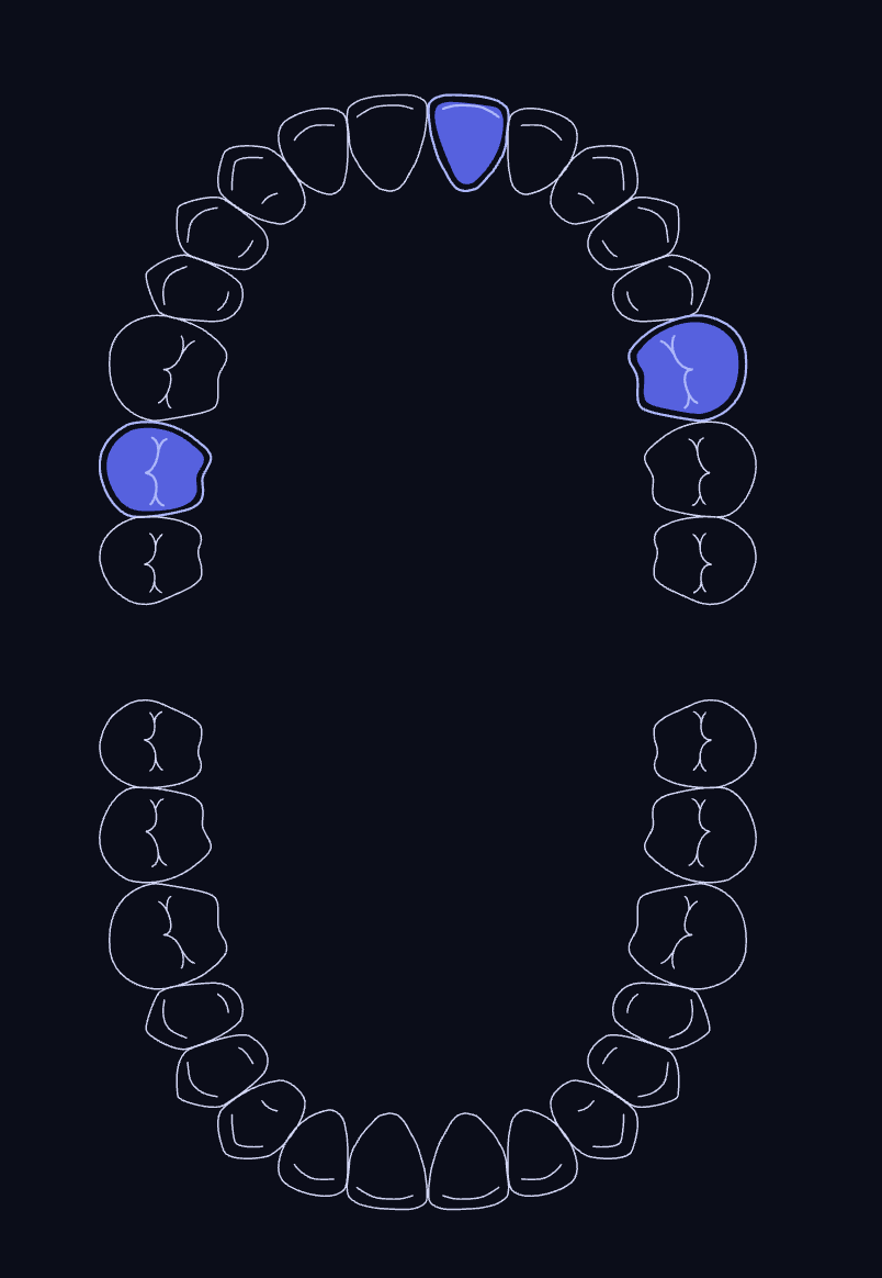 |
Run the Storybook locally with pnpm storybook. The original project's live
preview (0.5.x features only) is at
biomathcode.github.io/react-odontogram.
Run the local example site (in examples/responsive-site) with dentitions,
layouts, notations, conditions, surfaces, findings, tooth states, a tooth
inspector and SVG/PNG/JSON export:
cd examples/responsive-site
npm install
npm run dev# Using npm
npm install @kmanueldc/react-odontogram
# Using pnpm
pnpm add @kmanueldc/react-odontogram
# Using yarn
yarn add @kmanueldc/react-odontogramMake sure you have
reactandreact-dom(17 or later) installed as peer dependencies.
Not published from this fork yet. The original package installs with:
# Using npm
npm install react-native-odontogram react-native-svg

# Using pnpm
pnpm add react-native-odontogram react-native-svg

# Using yarn
yarn add react-native-odontogram react-native-svg
Make sure your React Native app has
react,react-native, andreact-native-svginstalled.
import { Odontogram } from "@kmanueldc/react-odontogram";
import "@kmanueldc/react-odontogram/style.css";

export default function App() {
  return (
    <Odontogram
      idFormat="fdi"
      onChange={(selectedTeeth) => console.log(selectedTeeth)}
    />
  );
}
onChange receives the selected teeth in selection order:
type ToothDetail = {
  id: string; // "21", or "teeth-21" without idFormat="fdi"
  notations: { fdi: string; universal: string; palmer: string };
  type: string;
};
[
{
"id": "21",
"notations": { "fdi": "21", "universal": "9", "palmer": "1UL" },
"type": "Central Incisor"
}
]Use the separate react-native-odontogram package:
import { NativeOdontogram } from "react-native-odontogram";

export default function App() {
  return (
    <NativeOdontogram
      dentition="primary"
      height={420}
      onChange={(selectedTeeth) => console.log(selectedTeeth)}
      toothStates={{ "54": "extracted" }}
      width="100%"
    />
  );
}<Odontogram /> {/* dentition="permanent": 32 teeth, FDI 11–48 */}<Odontogram dentition="primary" idFormat="fdi" defaultValue={["51", "52", "65"]} />Draws the 20 primary teeth (FDI 51–55, 61–65, 71–75, 81–85) with the same
selection, conditions, tooltip, legend and half charts as the permanent
chart. Universal numbers are A–T.
Provisional shapes. The primary tooth outlines are approximations for visual development. They are not clinically validated anatomy and must not be used for diagnosis. See License and SVG provenance.
maxTeeth={5} is not a primary dentition: it shows permanent incisors,
canine and premolars. It is deprecated in favor of dentition="primary".
<Odontogram
  dentition="mixed"
  layout="horizontal"
  teeth={["16", "11", "21", "26", "55", "54", "53", "63", "64", "65"]}
/>
Draws the permanent and primary teeth together, each with its own shape and
FDI ID, in four rows: upper permanent, upper primary, lower primary and lower
permanent. In horizontal each primary molar sits under the premolar that
replaces it; in arch the primary arches are drawn inside the permanent ones.
teeth lists the teeth present in the mouth; the others are not drawn. It
works with every dentition and warns in development about IDs that do not
belong to it. The chart keeps its size whatever teeth contains. The library
has no eruption or replacement rules: the app decides which teeth to list.
Details in docs/mixed-dentition.md.
<Odontogram layout="arch" />        {/* default: the dental arches */}
<Odontogram layout="horizontal" />  {/* two rows, printable */}
<Odontogram showHalf="upper" />     {/* or "lower"; "full" by default */}
Every dentition works in both layouts and half charts. The 0.5.x names
layout="circle" and layout="square" still work (with a development
warning) as aliases of arch and horizontal.
const [selected, setSelected] = useState<string[]>(["11"]);

<Odontogram
  idFormat="fdi"
  value={selected}
  onChange={(teeth) => setSelected(teeth.map(({ id }) => id))}
  singleSelect={false}
  name="teeth" // hidden input with the selected IDs as JSON, for forms
  showLabels
  conditions={[
    { label: "caries", teeth: ["16", "26"], fillColor: "#ef4444", outlineColor: "#b91c1c" },
    { label: "filling", teeth: ["14", "24"], fillColor: "#60a5fa", outlineColor: "#1d4ed8" },
  ]}
/>- Controlled or not. Pass
value+onChangeto control the selection, ordefaultValue(aliasdefaultSelected) for an uncontrolled chart. - IDs. Inputs accept
"11"and the 0.5.x"teeth-11".idFormatchooses what leaves the chart (onChange, the form input, surface callbacks):"legacy"("teeth-11", default in 0.6) or"fdi"("11"). - Single select.
singleSelectkeeps one tooth; clicking it clears it. - Disabled.
disabled(aliasreadOnly) shows the chart without selection or keyboard interaction. - Conditions.
conditionscolors groups of teeth (later groups win for the same tooth);showLabelsadds the legend, which also lists tooth states and findings.teethConditionsis the deprecated 0.5.x alias.
| Prop | Type | Default | Description |
|---|---|---|---|
dentition |
"permanent" | "primary" | "mixed" |
"permanent" |
Teeth to draw; see Dentitions. |
teeth |
string[] |
— | Teeth present in the mouth (either ID format); every tooth of the dentition when omitted. |
layout |
"arch" | "horizontal" |
"arch" |
Arch or row layout. "circle" and "square" still work but are deprecated. |
showHalf |
"full" | "upper" | "lower" |
"full" |
Full chart or one arch. |
value |
string[] |
— | Selected tooth IDs of a controlled chart; update it from onChange. |
defaultValue |
string[] |
[] |
Tooth IDs selected on first render of an uncontrolled chart. |
defaultSelected |
string[] |
[] |
Alias of defaultValue. |
onChange |
(selectedTeeth: ToothDetail[]) => void |
— | Called whenever the selection changes. |
idFormat |
"legacy" | "fdi" |
"legacy" |
IDs returned by callbacks and the form input: "teeth-11" or "11". |
singleSelect |
boolean |
false |
Only one tooth at a time. |
disabled |
boolean |
false |
No selection or keyboard interaction. |
readOnly |
boolean |
false |
Alias of disabled. |
name |
string |
"teeth" |
Name of the hidden form input. |
conditions |
ToothConditionGroup[] |
— | Colors per group of teeth. |
teethConditions |
ToothConditionGroup[] |
— | Deprecated alias of conditions. |
showLabels |
boolean |
false |
Legend of conditions, states and findings. |
toothStates |
Record<string, ToothState> |
— | missing, extracted, implant or unerupted per tooth. |
findings |
OdontogramFinding[] |
— | Clinical findings and treatments. |
findingCatalog |
FindingCatalog |
ntsPeruFindingCatalog |
Names and symbols of the finding codes. |
showSurfaces |
boolean |
false |
Five-surface diagram next to each tooth. |
showSurfaceLetters |
boolean |
false |
Each surface's letter on the diagrams. |
surfaceShape |
"square" | "circle" |
"square" |
Shape of the surface diagrams. |
surfaces / defaultSurfaces |
Record<string, ToothSurface[]> |
— | Selected surfaces per tooth, controlled / uncontrolled. |
onSurfacesChange |
(surfaces) => void |
— | Next surfaces after a click, keyed by ID in idFormat. |
onSurfaceClick |
(tooth, surface, surfaces) => void |
— | A surface was clicked or toggled with the keyboard. |
renderSurfaceMenu |
(props: SurfaceMenuRenderProps) => ReactNode |
— | Menu opened on a surface instead of toggling it. |
notation |
"FDI" | "Universal" | "Palmer" |
"FDI" |
Notation of numbers, titles and accessible names. IDs stay FDI. |
showNumbers |
boolean |
false |
Each tooth's number next to it. |
renderNumber |
(props: OdontogramNumberRenderProps) => ReactNode |
— | Custom SVG for each number. |
showTooltip |
boolean |
true |
Tooltip on hover and keyboard focus. |
tooltip |
{ placement?: Placement; margin?: number; content?: ReactNode | ((payload?: ToothDetail) => ReactNode) } |
{ placement: "top", margin: 10 } |
Tooltip position and 0.5.x content. |
renderTooltip |
(props: OdontogramTooltipRenderProps) => ReactNode |
— | Custom tooltip content; wins over tooltip.content. |
renderOverlay |
(props: OdontogramOverlayRenderProps) => ReactNode |
— | SVG drawn above the chart with the tooth anchors. |
labels |
OdontogramLabelsInput |
English | Texts of the chart; partial overrides of defaultOdontogramLabels. |
theme |
"light" | "dark" |
"light" |
Built-in palette. |
colors |
OdontogramColors |
{} |
Theme colors; see Theme. |
selectedColor / hoverColor |
string |
— | Fill of selected / hovered teeth. |
className |
string |
"" |
Extra class of the container. |
styles |
CSSProperties |
— | Inline styles of the container (CSS variables included). |
maxTeeth |
number |
— | Deprecated. Cuts each quadrant to its first teeth; not a primary dentition. |
type ToothConditionGroup = {
  label: string;
  teeth: string[]; // either ID format, e.g. ["teeth-11", "12"]
  outlineColor: string;
  fillColor: string;
};

type Placement =
  | "top" | "top-start" | "top-end"
  | "right" | "right-start" | "right-end"
  | "bottom" | "bottom-start" | "bottom-end"
  | "left" | "left-start" | "left-end";
The separate react-native-odontogram package is built on the same core
and model. It supports dentitions (dentition, teeth), layouts,
selection (value, defaultValue, singleSelect, idFormat,
onChange, onToothPress), notations and showNumbers, conditions,
toothStates, findings and findingCatalog, labels, theme and
colors, disabled, showHalf and the legend (showLabels).
Surfaces, the tooltip, the surface menu, the overlay and the inspector are
web only for now. Native-specific sizing is controlled with width,
height, and style. See its
README.
| Callback | When | Receives | vue-odontogram event |
|---|---|---|---|
onChange |
The tooth selection changes | ToothDetail[] |
update:modelValue, change, tooth-click |
onSurfacesChange |
A surface is toggled | OdontogramSurfaces |
update:surfaces |
onSurfaceClick |
A surface is clicked (also with a menu) | (tooth, surface, surfaces) |
surface-click |
SurfaceGuide onSurfaceClick / onActiveChange |
A guide surface is clicked / highlighted | ToothSurface |
surface-click, update:active |
ToothInspector onAddFinding / onRemoveFinding |
The panel asks to record / remove | ToothFindingInput / SurfaceFindingRemoval |
add-finding, remove-finding |
ToothInspector onSelectedSurfacesChange |
The surfaces chosen in the panel change | ToothSurface[] |
update:selectedSurfaces |
The Vue slots are render props: renderTooltip, renderNumber,
renderSurfaceMenu and renderOverlay.
<Odontogram
  showLabels
  toothStates={{ 18: "extracted", 28: "missing", 36: "implant", 48: "unerupted" }}
/>
toothStates marks the presence status of each tooth (IDs in either
format); unlisted teeth are present.
| State | Drawing |
|---|---|
missing |
Dashed outline, no crown details |
extracted |
Dashed outline and a red cross |
implant |
Implant fixture over the tooth |
unerupted |
Faded tooth |
States are visual only: selection, onChange and keyboard access do not
change. Each tooth gets data-tooth-state and the classes
odontogram-tooth--<state> (plus odontogram-tooth--absent for missing and
extracted teeth). The state is added to the accessible name (Tooth 18, Extracted), the default tooltip and renderTooltip({ state }), and
showLabels lists the visible states in the legend. Absent teeth are not
filled with their condition color and have no surfaces to select.
<Odontogram notation="Universal" showNumbers />
<Odontogram notation="Palmer" showNumbers />
notation (FDI, Universal or Palmer) sets the numbers drawn with
showNumbers, the tooth titles and the accessible names (Tooth 8 in
Universal, Tooth UR6 in Palmer). Palmer numbers get their quadrant corner as
SVG lines. IDs and onChange stay FDI; ToothDetail carries all three
notations (Palmer in the 0.5.x 6UR format). Primary teeth use A–T in
Universal and A–E in Palmer.
renderNumber receives each placed number (toothId, text, x, y,
fontSize, corner, selected, notation) to draw your own.
formatToothNumber(id, notation) and getPalmerQuadrant(id) are exported.
const [surfaces, setSurfaces] = useState({});

<Odontogram
  idFormat="fdi"
  showSurfaces
  showSurfaceLetters
  surfaces={surfaces}
  onSurfacesChange={setSurfaces} // { 16: ["mesial", "occlusal"] }
/>
showSurfaces draws a five-surface diagram (vestibular, mesial, occlusal,
distal, lingual) on the outer side of every tooth; the chart grows to fit
them. surfaceShape="circle" draws them as circles. Each surface is a
checkbox with a clinical name: Tooth 11, Incisal on incisors and canines,
Palatal on upper teeth.
- Selection. Surfaces have their own selection, independent of the
teeth: controlled (
surfaces+onSurfacesChange) or uncontrolled (defaultSurfaces). Keys may use either ID format; callbacks useidFormat.onSurfaceClick(tooth, surface, surfaces)reports each click. - Tooltip. Hovering or focusing a surface shows its name, definition,
the tooth state, its findings and whether it is selected;
renderTooltipreceivessurfaceandsurfaceName, andselectedthen refers to the surface. - Tooth states. Missing and extracted teeth have no surfaces to select:
their diagrams are faded and ignore clicks.
disabledblocks every surface.
<SurfaceGuide toothId="16" findings={findings} selected={surfaces["16"] ?? []} />SurfaceGuide draws one tooth's five surfaces in large, oriented like the
horizontal chart (vestibular out, mesial toward the midline), with the
letter, clinical name, definition and recorded findings of each surface.
Props: toothId, findings, findingCatalog, selected, active /
onActiveChange (the highlighted surface, which follows hover and focus),
onSurfaceClick, labels, notation, shape, disabled and showList.
const [findings, setFindings] = useState<OdontogramFinding[]>([]);

<SurfaceGuide
  toothId="16"
  findings={findings}
  onSurfaceClick={(surface) =>
    setFindings(addSurfaceFinding(findings, { code: "caries", toothId: "16", surfaces: [surface] }))
  }
/>
The record helpers never mutate their input and hold no clinical rules:
getToothRecord(toothId, findings, catalog?)groups everything recorded on a tooth: the findings of each surface and the whole-tooth ones.addSurfaceFinding(findings, { code, toothId, surfaces, status?, tone?, color? })records a surface finding, merging it into an identical one on the tooth.addFinding(findings, { code, toothId, surfaces?, status?, … }, catalog?)records any finding: surface codes throughaddSurfaceFinding, the rest on the whole tooth.removeSurfaceFinding(findings, { index, toothId, surface? })removes a surface (or, withoutsurface, the finding) from one tooth, splitting findings shared with other teeth.
<Odontogram
  showSurfaces
  findings={findings}
  renderSurfaceMenu={({ toothId, surface, surfaceName, record, close }) => (
    <div>
      <strong>{toothId} · {surfaceName}</strong>
      {record.surfaces[surface].map((entry) => (
        <button key={entry.index} onClick={() =>
          setFindings(removeSurfaceFinding(findings, { index: entry.index, toothId, surface }))}>
          Remove {entry.definition?.name}
        </button>
      ))}
      <button onClick={() =>
        setFindings(addSurfaceFinding(findings, { code: "caries", toothId, surfaces: [surface] }))}>
        Add caries
      </button>
      <button onClick={close}>Close</button>
    </div>
  )}
/>
With renderSurfaceMenu, clicking a surface (or Enter / Space on it) opens
a floating role="dialog" panel next to it instead of toggling its
selection; surfaces become menu buttons (aria-haspopup="dialog",
aria-expanded). The menu receives toothId, tooth, surface,
surfaceName, the tooth's record and close. It closes with close(),
Escape or a click outside (the first two return the focus to the surface),
hides the tooltip while open, and never opens on missing or extracted teeth
or on a disabled chart.
<ToothInspector
  toothId="36"
  findings={findings}
  toothStates={toothStates}
  selectedSurfaces={surfaces["36"] ?? []}
  onSelectedSurfacesChange={(next) => setSurfaces({ ...surfaces, 36: next })}
  onAddFinding={(input) => setFindings(addFinding(findings, input))}
  onRemoveFinding={(removal) => setFindings(removeSurfaceFinding(findings, removal))}
/>
ToothInspector shows a tooth's number, type and state, its surface
diagram, its findings by surface and on the whole tooth (with remove buttons)
and a form to add a finding on the surfaces chosen on the diagram. It saves
nothing: it reports onAddFinding and onRemoveFinding.
selectedSurfaces / onSelectedSurfacesChange share the chosen surfaces
with the chart; without them the panel keeps its own choice. disabled makes
it read-only.
<Odontogram
  showSurfaces
  showLabels
  findings={[
    { code: "caries", teeth: ["16"], surfaces: ["occlusal", "mesial"] },
    { code: "crown", teeth: ["21"], status: "planned" },
    { code: "fixed-prosthesis", teeth: ["44", "46"] },
    { code: "mobility", teeth: ["31"], label: "M2" },
    { code: "fracture", teeth: ["11"], color: "#7c3aed" },
  ]}
/>
Each finding has a catalog code and the teeth it applies to (IDs in
either format).
- Scopes. Surface symbols (
fill,outline) go on the surface diagrams (surfaces, every surface when omitted; they needshowSurfaces). Whole-tooth symbols (cross, circle, arrows, abbreviations…) draw one per listed tooth.betweensymbols (diastema, transposition) take two teeth;spansymbols (prostheses, orthodontic appliances, edentulous) cover the arch range from the first to the last listed tooth. - Color. Blue is a good state or a completed treatment, red a bad state
or a pending one.
status(existing,planned,done) andtone(good,bad) override the catalog;colortakes any CSS color. Planned findings are dashed. Several findings on one surface share it in strips. - Options.
labelchanges an abbreviation (M2),direction(mesial/distal) points migration arrows. - Text. Findings are added to each tooth's accessible name and tooltip
(whole-tooth findings, then a line per surface);
renderTooltipreceivesfindingsandsurfaceSummary;showLabelslists each one in the legend with its icon. Unknown codes and teeth that are not drawn are skipped with a development warning.
ntsPeruFindingCatalog (the default findingCatalog) has 35 codes of the
Peruvian technical norm for the odontogram: caries, restoration,
temporary-restoration, extraction, fracture, crown,
temporary-crown, extruded, intruded, rotated, migrated,
erupting, supernumerary, fusion, peg, implant, root-remnant,
mobility, discolored, ectopic, impacted, semi-impacted,
macrodontia, microdontia, worn, pulp-treatment, enamel-defect,
diastema, transposition, fixed-prosthesis, removable-prosthesis,
complete-prosthesis, fixed-orthodontic-appliance,
removable-orthodontic-appliance and edentulous.
The catalog is still pending verification against the official text of the norm (sealants, material abbreviations). Review it before clinical use.
const catalog = {
  ...ntsPeruFindingCatalog,
  sealant: { name: "Sealant", tone: "good", symbol: { kind: "text", text: "S" } },
};

<Odontogram findingCatalog={catalog} findings={[{ code: "sealant", teeth: ["36"] }]} />
A FindingCatalog maps codes to { name, symbol, tone }. Symbols:
fill, outline, line, cross, circle, double-circle, triangle,
arrow, curved-arrow, zigzag, text, encircled-text, diastema,
transposition, bridge, double-line, brackets, zigzag-line and
center-line. getFindingScope(symbol) tells where each is drawn.
- Teeth. The chart is a single tab stop: Tab reaches the last focused
tooth, else the first selected one, else the first tooth. Arrow keys,
HomeandEndmove between teeth (and between the rows of a mixed chart) without selecting; Enter or Space toggles the selection. The tooltip follows the focus. - Surfaces. The surface diagrams are a second tab stop. Left/right,
HomeandEndmove between teeth (skipping missing and extracted ones); up/down between the surfaces of a tooth; Enter or Space toggles the surface or opens its menu. Escape closes the menu.
<Odontogram
  tooltip={{ placement: "right-start", margin: 18 }}
  renderTooltip={({ tooth, number, selected, condition, state, findings }) => (
    <div>
      <strong>{tooth.type} {number}</strong>
      {selected && " ✓"}
      {condition && <div>{condition.label}</div>}
      {state !== "present" && <div>{state}</div>}
      {findings.length > 0 && <div>{findings.join(", ")}</div>}
    </div>
  )}
/>
renderTooltip receives tooth, detail (the ToothDetail of
onChange), selected, condition, state, findings, number,
surface, surfaceName and surfaceSummary. tooltip.placement and
tooltip.margin still position it, and the 0.5.x tooltip.content (a node
or a function of the ToothDetail) keeps working.
<Odontogram
  renderOverlay={({ anchors }) => (
    <circle cx={anchors["16"].center.x} cy={anchors["16"].box.y} r={4} fill="#f59e0b" />
  )}
/>
renderOverlay draws your own SVG above the chart, in its viewBox
coordinates. It receives the anchors of the drawn teeth (anchors by FDI ID
and anchorList in drawing order; each with toothId, quadrant, arch,
dentition, row, box and center), the rendered viewBox as a box,
dentition, layout and the surfaceDiagrams. Only visible teeth are
included. Clicks go through the overlay to the teeth unless an element sets
pointer-events.
getToothAnchors(dentition, layout), getLayoutViewBox(dentition, layout)
and parseViewBox(viewBox) give the same geometry without rendering.
<Odontogram
  labels={{
    odontogram: "Odontograma",
    chartTitles: { permanent: "odontograma permanente" },
    tooth: "Pieza",
    type: "Tipo",
    condition: "Condición",
    legend: "Leyenda",
    states: { extracted: "Extraída", missing: "Ausente" },
    surfaceNames: { palatal: "Palatino" },
  }}
/>
labels translates every text: the container and SVG names, the tooth
prefix, the tooltip, the legend, tooth types, states, finding statuses,
surface names, letters and definitions, and the texts of SurfaceGuide and
ToothInspector (inspector.*). Overrides are partial and nested maps are
merged; defaultOdontogramLabels lists every key. Finding names come from
the catalog.
<Odontogram
  className="my-odontogram"
  theme="dark"
  colors={{ stroke: "#c7d2fe", selected: "#4f46e5", accent: "#7c9cff" }}
/>.my-odontogram {
--odontogram-tooltip-bg: #0f172a;
--odontogram-tooltip-fg: #f8fafc;
}The CSS variables are the same as in vue-odontogram, and can be set on
the chart or any ancestor:
| Variable | Colors | Default |
|---|---|---|
--odontogram-stroke-color |
Tooth outlines | --base-blue |
--odontogram-selected-color |
Selected tooth fill | --light-blue |
--odontogram-hover-color |
Hovered tooth fill | selected color |
--odontogram-accent-color |
Selected surfaces, selected numbers, highlights | --dark-blue |
--odontogram-selected-stroke-color |
Selected tooth stroke | accent color |
--odontogram-focus-outline-color |
Keyboard focus ring | accent color |
--odontogram-number-color, --odontogram-number-selected-color |
Tooth numbers | #64748b, accent |
--odontogram-surface-fill, -stroke-color, -hover-color, -selected-color, -focus-color, -letter-color |
Surface diagrams | white, stroke, hover, accent, accent, #334155 |
--odontogram-finding-good-color, --odontogram-finding-bad-color |
Findings | #1d4ed8, #dc2626 |
--odontogram-finding-planned-dasharray, --odontogram-finding-planned-fill-opacity |
Planned findings | from the stroke, 0.45 |
--odontogram-extracted-color, --odontogram-implant-color, --odontogram-implant-fill |
State marks | #dc2626, #0f766e, #ccfbf1 |
--odontogram-absent-opacity, --odontogram-unerupted-opacity |
Missing / unerupted teeth | 0.55, 0.45 |
--odontogram-tooltip-bg, --odontogram-tooltip-fg |
Tooltip | dark / light by theme |
--odontogram-surface-menu-bg, -fg, -border |
Surface menu | #fff, #1e293b, #cbd5e1 |
--odontogram-surface-guide-active-bg |
Surface guide | #eef2ff |
theme, colors, selectedColor and hoverColor are shortcuts: theme
and the 0.5.x keys of colors (darkBlue, baseBlue, lightBlue) set
--dark-blue, --base-blue and --light-blue, the fallbacks of the table;
the other keys of colors (stroke, selected, hover, selectedStroke,
accent), selectedColor and hoverColor set the variables above.
theme="dark" also switches the surface, finding and legend defaults. Every
style ships in @kmanueldc/react-odontogram/style.css.
Everything is exported from @kmanueldc/react-odontogram, with the same names as
vue-odontogram where both have it.
| Group | Exports |
|---|---|
| Components | Odontogram (also the default export), Tooth, SurfaceGuide, ToothInspector |
| Hooks | useOdontogram, buildOdontogramModel, useToothSelection, useSurfaceSelection |
| Notation | formatToothNumber, getPalmerQuadrant, getToothType, buildToothId, getQuadrant, defaultOdontogramLabels, toothStates |
| Findings | ntsPeruFindingCatalog, findingStatuses, getFindingScope, resolveFindingTone, getToothRecord, addFinding, addSurfaceFinding, removeSurfaceFinding |
| Surfaces | toothSurfaces, surfaceShapeKinds, getSurfaceName, toggleSurface |
| Geometry | getToothAnchors, getLayoutViewBox, parseViewBox, getViewBox (0.5.x) |
Types include the props of every component (OdontogramProps,
ToothProps, SurfaceGuideProps, ToothInspectorProps), the render-prop
payloads (OdontogramTooltipRenderProps, OdontogramNumberRenderProps,
SurfaceMenuRenderProps, OdontogramOverlayRenderProps), the model
(ToothDefinition, ToothAnchor, OdontogramFinding, FindingCatalog,
ToothRecord, OdontogramSurfaces, OdontogramToothStates…) and the 0.5.x
types (ToothDetail, ToothConditionGroup, TeethProps, Placement).
Each tooth is a ToothDefinition: { id, quadrant, position, dentition, type, shape },
where shape holds its SVG paths (outlinePath, shadowPath,
lineHighlightPath) and local transform.
MIT. Copyright © 2025 Pratik Sharma (biomathcode) and © 2026 Manuel Díaz Calua; see LICENSE.
- The permanent tooth SVG data comes from the original
react-odontogram0.5.x (MIT © biomathcode). - The framework-free core (
packages/odontogram-core: types, layouts, notation, surfaces, findings, NTS Peru catalog) and the primary tooth SVG data are ported fromvue-odontogram, MIT © Manuel Díaz; see THIRD_PARTY_NOTICES.md. - The primary datasets are provisional simplified paths for prototyping. They have no dental validation and must not be used for diagnosis, treatment or as a definitive clinical representation.
Requires Node.js >= 18.
git clone https://github.com/kmanuelDC/react-odontogram.git
cd react-odontogram
pnpm install
pnpm dev          # build in watch mode, Storybook and tests
pnpm test         # Vitest
pnpm lint:ci      # Biome
pnpm build        # tsup
pnpm storybook    # Storybook only
The repository is a pnpm workspace. The geometry, notation, layouts, surfaces
and findings live in packages/odontogram-core
(@kmanueldc/odontogram-core, no framework). The library imports it from
source during development and pnpm build bundles it, so @kmanueldc/react-odontogram
has no runtime dependency on it.
Visual baselines: pnpm storybook:build && pnpm baseline:capture <dir>
captures one PNG per story; see docs/baseline/README.md.
This project is a fork of react-odontogram,
created by Pratik Sharma (biomathcode) and its
contributors. The original component, the permanent tooth SVG data, the
0.5.x API and the React Native package are their work. If you only need the
original feature set, consider using the upstream package.
Issues and PRs about this fork go to kmanuelDC/react-odontogram. Please don't report problems with this fork to the original project.